Color Theory for High End Professional Wardrobe Curation
Introduction: The Power of Strategic Color in Professional Dressing
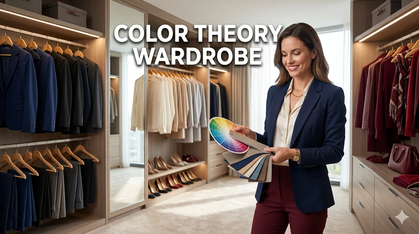
In the competitive landscape of modern business, your professional appearance serves as a silent ambassador for your personal brand. While fit, fabric, and style undoubtedly matter, color theory professional wardrobe strategies represent one of the most powerful yet underutilized tools for creating a polished, authoritative, and memorable professional image. Understanding how to strategically select and combine colors can transform a collection of expensive pieces into a cohesive, high-end wardrobe that works effortlessly for you.
The difference between looking well-dressed and looking impeccably styled often comes down to color coordination. A professional wardrobe color palette built on color theory principles ensures that every piece in your closet works harmoniously with others, maximizing outfit combinations while minimizing decision fatigue. This strategic approach to color selection is what separates those who simply wear clothes from those who cultivate a signature professional presence.
This comprehensive guide will walk you through the science and art of applying color theory to curate a high end wardrobe that projects confidence, competence, and sophistication. From understanding your personal color season to mastering complementary and analogous color schemes, from building a versatile neutral foundation to incorporating strategic pops of color, you will learn how to create a professional wardrobe that not only looks expensive but communicates your professional excellence before you even speak a word.
Understanding Color Theory Fundamentals for Professional Dressing
Before diving into wardrobe curation, it is essential to grasp the foundational principles of color theory that will inform every clothing decision you make. Color theory is not merely an artistic concept—it is a scientific framework that explains how colors interact, complement, and influence perception.
The Color Wheel and Professional Applications
The traditional color wheel consists of twelve colors arranged in a specific relationship to one another. For professional wardrobe building, understanding these relationships is crucial:
- Primary Colors: Red, blue, and yellow form the foundation of all other colors. In professional contexts, navy blue serves as a cornerstone neutral, while red functions as a powerful accent color for leadership presence.
- Secondary Colors: Green, orange, and purple result from mixing primary colors. These work well as secondary pieces in professional wardrobes—emerald green blazers, burgundy accessories, or teal blouses.
- Tertiary Colors: Created by mixing primary and secondary colors, these include shades like blue-green, red-orange, and yellow-green. These sophisticated hues add depth and interest to professional ensembles.
Color Properties That Matter for Professional Wear
Three key properties determine how a color functions in your professional wardrobe:
- Hue: The pure color itself (red, blue, green). Professional settings typically favor cooler, more muted hues over bright, warm tones.
- Saturation: The intensity or purity of a color. High saturation creates bold statements; low saturation produces sophisticated, muted tones ideal for professional environments.
- Value: How light or dark a color appears. Professional wardrobes benefit from a range of values, with darker values conveying authority and lighter values suggesting approachability.
Key Insight: The most sophisticated professional wardrobes balance these properties strategically, using darker values and lower saturation for core pieces while incorporating selective higher saturation for impact.
Psychological Impact of Color in Business Settings
Research consistently demonstrates that color influences perception in professional contexts:
- Navy Blue: Associated with trust, stability, and competence. It is the safest and most versatile professional color.
- Charcoal Gray: Conveys sophistication, neutrality, and analytical thinking. Excellent for executive presence.
- Black: Projects authority, luxury, and formality. Best reserved for evening events or creative industries.
- Burgundy/Wine: Suggests confidence, ambition, and refined taste without the aggression of bright red.
- Forest Green: Communicates growth, balance, and financial acumen. Increasingly popular in professional settings.
- Cream/Ivory: Softer alternative to white, suggesting approachability and elegance.
Understanding these associations allows you to strategically choose colors that align with your professional goals and the message you wish to convey.
Discovering Your Personal Color Season
One of the most transformative steps in curating a professional wardrobe color palette is identifying your personal color season. This system categorizes individuals based on their skin undertone, eye color, and hair color, determining which hues naturally enhance their appearance.
Understanding Undertones
Your skin undertone is the subtle hue beneath your surface skin color that remains constant regardless of tan or complexion changes:
- Cool Undertones: Veins appear blue or purple; silver jewelry flatters more than gold; skin has pink, red, or blue hints. You likely burn before tanning.
- Warm Undertones: Veins appear green; gold jewelry is more flattering; skin has yellow, peach, or golden hints. You tan easily.
- Neutral Undertones: Both metals suit you; veins appear blue-green; you have a balance of warm and cool characteristics.
The Four Season Categories
Spring (Warm and Light):
- Characteristics: Warm undertones, light eyes (blue, green, light hazel), hair ranges from blonde to light brown with golden or strawberry tones
- Best Professional Colors: Camel, warm navy, coral, peach, warm gray, cream, golden yellow, aqua
- Avoid: Harsh black, icy pastels, jewel tones that overwhelm your natural warmth
Summer (Cool and Light):
- Characteristics: Cool undertones, light eyes (blue, gray, green), ash-toned hair from blonde to brown
- Best Professional Colors: Soft navy, lavender, powder blue, rose pink, soft gray, mint green, periwinkle
- Avoid: Orange, tomato red, mustard yellow, and other warm, intense colors
Autumn (Warm and Deep):
- Characteristics: Warm undertones, rich eyes (brown, hazel, amber), hair with golden, red, or warm brown tones
- Best Professional Colors: Olive green, burgundy, mustard, camel, rust, chocolate brown, warm teal, cream
- Avoid: Pastels, icy colors, stark white, and neon brights
Winter (Cool and Deep):
- Characteristics: Cool undertones, deep eyes (dark brown, black, bright blue), hair ranges from dark brown to black or platinum blonde
- Best Professional Colors: True black, navy, emerald green, royal blue, fuchsia, icy pink, pure white, burgundy
- Avoid: Muted tones, orange, warm browns, and golden yellows
Applying Your Season to Professional Wardrobe Building
Once you identify your season, use it as a filter for all wardrobe decisions. This does not mean excluding all colors outside your palette, but rather prioritizing those that make you look healthy, alert, and vibrant. When you wear colors aligned with your natural coloring, you appear more energetic and confident—qualities that enhance professional presence.
Expert Tip: If professional color analysis feels overwhelming, start with the metal test. If silver jewelry makes your skin glow and gold makes you look sallow, you are cool-toned. If gold enhances your complexion and silver washes you out, you are warm-toned. This simple test provides a reliable starting point.
Building Your Professional Color Foundation
Every high end wardrobe requires a solid foundation of neutral colors that serve as the backbone of your professional attire. These versatile pieces create the canvas upon which you build varied, sophisticated outfits.
Essential Neutral Colors for Professional Wardrobes
1. Navy Blue:
The undisputed champion of professional dressing, navy works for virtually every skin tone and occasion. It is less severe than black while maintaining authority and sophistication.
- Investment pieces: Navy suit, navy blazer, navy sheath dress, navy trousers
- Pairs with: virtually every color, making it infinitely versatile
- Best for: client meetings, presentations, interviews, daily office wear
2. Charcoal Gray:
Charcoal strikes the perfect balance between formal and approachable, making it ideal for modern professional environments.
- Investment pieces: Charcoal suit, gray pencil skirt, gray blazer, gray coat
- Pairs with: pink, blue, green, purple, burgundy, and most jewel tones
- Best for: executive meetings, conferences, professional events
3. Black:
While not universally flattering for all color seasons, black remains a wardrobe essential for its slimming effect and formal elegance.
- Investment pieces: Black blazer, black trousers, little black dress, black pumps
- Pairs with: everything, particularly effective with metallics and bold colors
- Best for: evening events, formal presentations, creative industries
4. Camel and Taupe:
These warm neutrals add sophistication and work particularly well for those with warm undertones.
- Investment pieces: Camel coat, taupe blazer, neutral trousers
- Pairs with: navy, cream, burgundy, olive green, chocolate brown
- Best for: business casual settings, layering pieces
5. Crisp White and Cream:
Essential for shirts, blouses, and summer professional wear.
- Investment pieces: White button-down, cream silk blouse, white tailored shirt
- Pairs with: everything; creates clean, polished looks
- Best for: year-round professional wear, particularly effective in spring and summer
The 70-20-10 Color Ratio Rule
To create a balanced, cohesive professional wardrobe color palette, follow this proven ratio:
- 70% Neutral Foundation: Navy, gray, black, camel, white, cream. These pieces form the backbone of your wardrobe and should be your highest-quality investments.
- 20% Secondary Colors: Colors that complement your neutrals and align with your season—burgundy, forest green, teal, dusty rose, or chocolate brown. These add variety while maintaining professionalism.
- 10% Accent Colors: Bold choices that express personality—emerald green, cobalt blue, fuchsia, or mustard. Use these strategically in accessories, blouses, or statement pieces.
This ratio ensures versatility while allowing for personal expression. It also simplifies getting dressed, as the majority of your wardrobe automatically coordinates.
Mastering Color Coordination Techniques
Understanding color relationships enables you to create sophisticated, intentional outfits that demonstrate sartorial expertise. These proven color coordination techniques form the foundation of high end wardrobe styling.
Monochromatic Dressing
Monochromatic dressing involves wearing different shades, tones, and tints of a single color. This technique creates an elongated, sophisticated silhouette and is favored by fashion insiders for its effortless elegance.
How to Execute:
- Choose a base color (navy, gray, or camel work beautifully)
- Select pieces in varying depths of that color
- Add texture variation to prevent flatness (silk blouse with wool trousers, for example)
- Include metallic accessories for visual interest
Professional Example: Navy cashmere sweater, navy wool trousers, navy blazer in a slightly different shade, silver jewelry, navy pumps. The result is powerful, cohesive, and unmistakably expensive-looking.
Complementary Color Schemes
Complementary colors sit opposite each other on the color wheel, creating vibrant contrast when paired together. In professional contexts, use this technique judiciously.
Professional Applications:
- Navy and Camel: A classic professional combination that works for every occasion
- Gray and Burgundy: Sophisticated and seasonally appropriate for fall and winter
- Charcoal and Blush: Modern and feminine without sacrificing professionalism
Implementation Strategy: Use complementary colors in a 60-40 ratio rather than 50-50. For example, a navy suit (60%) with a camel blouse and accessories (40%) creates balance without overwhelming.
Analogous Color Schemes
Analogous colors sit adjacent to each other on the color wheel, creating harmonious, pleasing combinations that feel cohesive and intentional.
Professional Examples:
- Blue, Blue-Green, and Green: Navy blazer, teal blouse, forest green trousers
- Red, Red-Violet, and Violet: Burgundy suit, plum blouse, mauve accessories
- Blue, Blue-Violet, and Violet: Navy trousers, periwinkle blouse, lavender blazer
This technique demonstrates advanced color knowledge while maintaining professional appropriateness.
Triadic Color Schemes
Triadic schemes use three colors equally spaced on the color wheel. While potentially bold, they can work professionally when one color dominates.
Professional Application:
- Navy (dominant), burgundy (secondary), and gold (accent)
- Charcoal (dominant), forest green (secondary), and rust (accent)
Use triadic schemes primarily in accessories or when building a capsule wardrobe with maximum versatility.
The Neutral Plus One Formula
For daily professional dressing, the simplest and most effective approach is the neutral plus one formula:
- Start with a neutral base (navy suit, gray dress, black trousers)
- Add one color element (colored blouse, statement shoes, colored blazer)
- Keep remaining elements neutral
This formula ensures you always look polished while allowing for variety and personal expression.
Strategic Color Placement for Maximum Impact
Where you place color in your outfit significantly affects the overall impression you create. Strategic color placement can enhance your best features, direct attention, and communicate specific messages.
Color Placement Near the Face
Colors worn near your face have the most significant impact on your appearance:
- Blouses and Shirts: Choose colors from your seasonal palette that make your skin glow and eyes bright
- Scarves: Excellent way to introduce flattering colors without committing to a full garment
- Statement Necklaces: Add color and draw attention upward
Key Principle: Always place your most flattering color closest to your face. If a particular shade washes you out, wear it as a bottom or accessory rather than a top.
Using Color to Direct Attention
Color naturally draws the eye. Use this principle strategically:
- To emphasize: Place brighter or bolder colors on areas you want to highlight
- To minimize: Use darker, more muted colors on areas you prefer to downplay
- To create balance: If wearing a bold bottom, balance with a neutral top, and vice versa
Color Blocking for Professional Impact
Color blocking—pairing solid blocks of contrasting colors—creates modern, confident looks when executed professionally:
- Keep blocks clean and simple (two to three colors maximum)
- Ensure colors are complementary or analogous
- Maintain professional appropriateness (avoid neon or overly bright combinations)
- Use structured pieces for polished results
Professional Example: Navy pencil skirt paired with a burgundy silk blouse and camel blazer creates sophisticated color blocking appropriate for executive settings.
Seasonal Color Transitions for Year-Round Professionalism
A high end wardrobe adapts to seasonal changes while maintaining professional standards. Understanding how to transition your color palette throughout the year ensures you always look appropriate and polished.
Spring Professional Palette
Spring calls for lighter, fresher interpretations of professional colors:
- Neutrals: Light gray, camel, cream, soft navy
- Secondary Colors: Dusty rose, mint green, powder blue, lavender
- Accents: Coral, aqua, soft yellow
- Fabrics: Lighter weight wools, cotton blends, silk
Summer Professional Palette
Summer professional dressing balances heat-appropriate fabrics with polished colors:
- Neutrals: White, cream, light gray, khaki
- Secondary Colors: Navy, sage green, soft teal, periwinkle
- Accents: Cobalt blue, fuchsia, emerald green
- Fabrics: Linen blends, lightweight wool, breathable cotton
Fall Professional Palette
Autumn welcomes richer, deeper tones that convey warmth and sophistication:
- Neutrals: Charcoal, chocolate brown, camel, navy
- Secondary Colors: Burgundy, forest green, mustard, rust
- Accents: Plum, teal, burnt orange
- Fabrics: Wool, cashmere, tweed, heavier cotton
Winter Professional Palette
Winter professional dressing embraces deep, rich colors and formal tones:
- Neutrals: Black, charcoal, navy, chocolate
- Secondary Colors: Emerald green, royal blue, burgundy, plum
- Accents: Fuchsia, icy blue, silver
- Fabrics: Heavy wool, cashmere, velvet accents
Expert Tip: Invest in transitional pieces that work across seasons. A navy blazer, for example, functions year-round when paired with appropriate seasonal colors and fabrics.
Investment Strategy: Color and Quality Prioritization
Building a professional wardrobe color palette requires strategic investment. Not all pieces warrant the same financial commitment, and understanding where to allocate resources maximizes your wardrobe's impact and longevity.
Where to Invest: The Color-Neutral Premium Pieces
Allocate the largest portion of your wardrobe budget to neutral foundation pieces in your best colors:
- Suits and Blazers: Navy and charcoal suits in premium wool should be your highest-quality investments. These pieces anchor your professional wardrobe and receive frequent wear.
- Coats: A well-tailored wool coat in camel, navy, or gray elevates every outfit and makes a powerful first impression.
- Trousers and Skirts: Neutral bottoms in quality fabrics provide versatility and professional polish.
- Shoes: Navy, black, and nude pumps or loafers in quality leather ensure longevity and professional appearance.
Where to Save: Trend Colors and Seasonal Pieces
Reserve moderate budgets for:
- Blouses and Tops: While quality matters, trendy colors or seasonal pieces do not require luxury price points
- Accessories: Scarves, statement jewelry, and bags in accent colors can be more affordable since they do not receive daily wear
- Trend Items: If a particular color is trending but may not have longevity, invest moderately
The Cost-Per-Wear Calculation
Before purchasing any piece, calculate cost-per-wear:
Formula: Price of item ÷ Number of times you will wear it = Cost per wear
Example: A $600 navy blazer worn twice monthly for three years (72 wears) = $8.33 per wear. A $150 trendy colored blazer worn six times = $25 per wear.
This calculation reveals why investing in quality neutral pieces in flattering colors provides superior long-term value.
Common Color Mistakes in Professional Wardrobes
Even well-intentioned professionals make color mistakes that undermine their polished appearance. Avoiding these common pitfalls ensures your color theory professional wardrobe strategy delivers maximum impact.
Mistake 1: Wearing Colors That Clash with Your Undertone
Problem: Wearing colors that fight your natural coloring makes you appear tired, sallow, or washed out, regardless of how expensive the garment is.
Solution: Identify your undertone and seasonal palette. When shopping, hold garments near your face in natural light. If the color makes you look vibrant and healthy, it is a keeper. If it creates shadows or dullness, pass on it.
Mistake 2: Too Many Competing Colors
Problem: Outfits with four or more distinct colors appear chaotic and unprofessional, suggesting poor planning rather than creativity.
Solution: Limit outfits to two to three colors maximum. Use the 70-20-10 ratio as a guide. When in doubt, monochromatic dressing always looks sophisticated.
Mistake 3: Ignoring Color Intensity
Problem: Mixing colors of vastly different intensities (neon with muted tones, for example) creates visual discord.
Solution: Keep color intensities relatively consistent within an outfit. Pair muted tones together or bright colors together, but avoid extreme contrasts unless deliberately creating high-fashion looks.
Mistake 4: Neglecting Shoe and Bag Coordination
Problem: Shoes and bags in clashing colors or too many different colors fragment the outfit.
Solution: Match or coordinate shoes and bags. Neutral shoes and bags (nude, black, navy, tan) provide maximum versatility. If wearing colored accessories, ensure they complement rather than compete with your outfit.
Mistake 5: Following Trends Over Timelessness
Problem: Building a professional wardrobe around trendy colors results in dated pieces that require constant replacement.
Solution: Anchor your wardrobe in timeless colors (navy, gray, camel, black) and incorporate trends sparingly through accessories or moderately-priced pieces you can rotate seasonally.
People Also Ask: Common Questions About Professional Wardrobe Color
What is the most professional color for business attire?
Navy blue consistently ranks as the most professional and versatile color for business attire. It conveys trust, competence, and authority while suiting virtually every skin tone and occasion. Charcoal gray follows closely as a sophisticated alternative. Both colors work for interviews, client meetings, presentations, and daily office wear, making them essential foundation colors for any professional wardrobe color palette.
How many colors should be in a professional wardrobe?
A well-curated professional wardrobe should include 3-4 neutral foundation colors (navy, gray, black, camel), 3-4 secondary colors that complement your neutrals and align with your season, and 2-3 accent colors for variety. This 8-11 color palette provides sufficient variety for daily dressing while ensuring all pieces coordinate effortlessly. Quality and versatility matter more than quantity.
Can I wear bright colors to work?
Yes, bright colors can be appropriate for professional settings when used strategically. Incorporate bright colors through blouses, accessories, or statement pieces while keeping the majority of your outfit in neutral tones. Consider your industry culture—creative fields embrace bold colors more readily than conservative sectors like law or finance. Always ensure bright colors align with your seasonal palette and are worn in appropriate contexts.
What colors should I avoid in professional settings?
Avoid neon colors, overly bright oranges, and fluorescent shades, as they appear unprofessional and distract from your message. Extremely muted, muddy colors can make you appear tired or unenergetic. Additionally, avoid wearing colors that clash with your undertone, as they diminish your natural radiance. Context matters—what works in a creative agency may not suit a corporate law firm.
How do I build a professional wardrobe on a budget?
Start with quality neutral foundation pieces in navy, gray, and black, as these provide maximum versatility. Shop sales for these investment items. Add moderately-priced blouses and accessories in colors that complement your palette. Prioritize fit over brand name—a well-fitted moderate-priced garment looks more expensive than an ill-fitting luxury piece. Build gradually, focusing on cost-per-wear rather than initial price. Thrift and consignment stores often offer quality professional pieces at fraction of retail cost.
Conclusion: Your Color-Confident Professional Future
Mastering color theory professional wardrobe principles transforms not just your appearance, but your entire professional presence. When your clothing colors harmonize with your natural coloring and work together cohesively, you project an image of intentionality, expertise, and attention to detail that opens doors and commands respect.
Remember that building a high end wardrobe based on color theory is a journey, not a destination. Start by identifying your seasonal palette and investing in quality neutral foundation pieces. Gradually incorporate secondary and accent colors that align with your professional goals and personal style. Practice different color coordination techniques, from monochromatic dressing to complementary schemes, until they become second nature.
The most successful professional wardrobes balance timeless principles with personal authenticity. Use color theory as a framework, not a rigid rulebook. Allow room for personal expression while maintaining professional appropriateness. As you develop your color-confident wardrobe, you will notice not only compliments on your appearance but also increased confidence in your professional interactions.
Your professional wardrobe is a powerful tool for career advancement. By strategically applying color theory principles, you ensure that this tool works optimally for you, creating lasting impressions of competence, sophistication, and leadership potential. Begin implementing these strategies today, and watch as your carefully curated professional wardrobe color palette becomes an invaluable asset in your professional success story.


0 Comments